On Design with Gareth Lind
After a brief hiatus, we are back with our On Design series, today featuring the wonderful Gareth Lind.
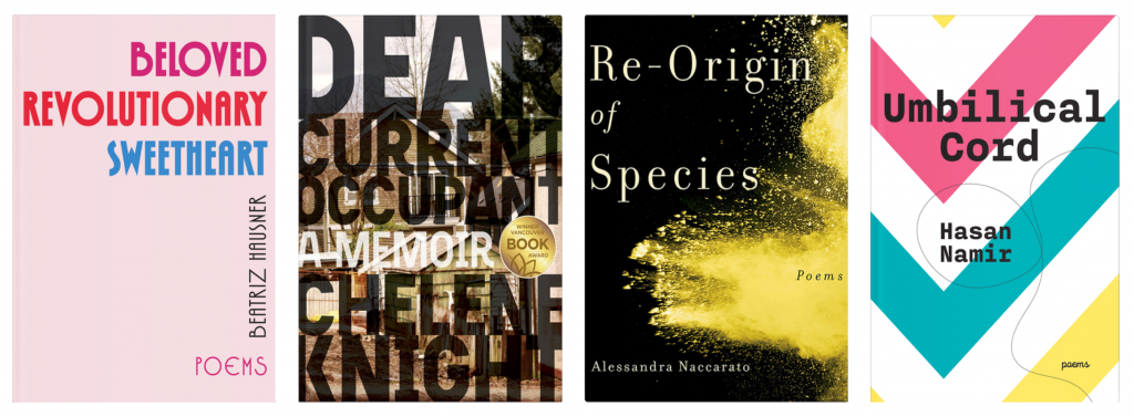
Lind’s designs are famously sleek, a confluence of clean lines and classical typeface, perfectly embodying the books they cloak. A number of our poetry titles—The Absence of Zero by R. Kolewe, Umbilical Cord by Hasan Namir, Plenitude by Daniel Sarah Karasik, and Beloved Revolutionary Sweetheart by Beatriz Hausner, among others—are Lind creations, all revealing his flare for visual unity.
Following an apprenticeship in Toronto and a stint at a design firm in Germany, Lind opened his own studio in Guelph, Ontario, where he has been collaborating for over two decades with book publishers and cultural institutions. Read on for Lind’s thoughts on the creative process, design trends, favourite book covers, and more.
B*H: To begin, how would you describe your creative process for designing a book cover?
GL: I read the author’s questionnaire, where they describe any directional ideas, and read enough of the book that I get a sense of its flavour–often, for poetry, the whole book. I look for common imagery or strong emotional undercurrents that unite the work. Sometimes I riff off the title, if that provides inspiration.
B*H: Do you usually end up with many different designs before picking the final ones to show to the writer and publisher? If so, are they usually similar? Can they be wildly different?
GL: Always different designs, and as different as possible, while still conveying what the book is about. I try for at least three, with usually one that plays with type and colour only. Sometimes the type treatment of a title will provide the key to the cover.
B*H: Does the genre of the book have a big impact on the way you think about design?
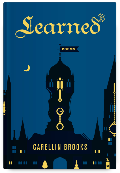
GL: Readers do judge books by their covers, and should have a good idea of what sort of book they will find inside. I sometimes deliberately “cross-genre” a book. For instance, for Learned, a collection of poems that tell a story of a woman at Oxford University who gets involved in the BDSM scene, I deliberately treated the design as if it were a long-form fiction book rather than a collection of poems.
B*H: Do you keep up with design trends? If so, is there one you can point to that has resonated with you recently?
GL: I like that simple is in these days, that a strong idea can carry a cover. My style is more distilled than ornate. I try to find the minimum amount of graphic imagery needed to achieve the desired effect. While I follow trends, I try not to be too tied to them. Trends are often fuelled by advances in graphic software technology. For instance, it’s far easier now to interweave title typography into the graphic, with elements overlapping or entwining into the type characters. Many current book titles follow this trend, so much so that I now try to avoid it unless there’s an aspect that makes the cover unique.
B*H: Do you have a favourite design you’ve done for Book*hug? What about it stuck with you?
GL: Probably Learned. It was basically an illustration using icons and flat stock graphics as source material, repurposed in an unusual way. I used the silhouette of the Oxford skyline and played with the classic vase/face optical illusion, as well as hiding BDSM sex toys within the gothic architecture. I like this cover because it is humorous (the similarities between sex toys and gothic architecture!) and playful. Not everything happening (e.g., the two profiles of faces) is evident at first glance. Some people may not even see the illusion. My favourite designs give secondary or even tertiary meanings on repeated views.
B*H: Can you tell us a little bit about your process designing Duct-Taped Roses?
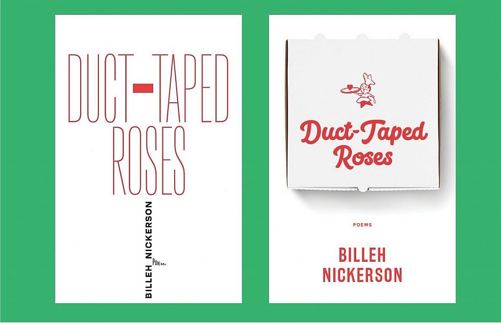
GL: Duct-Taped Roses was an easy cover design because the title has so many evocations. I provided five concepts and one of them was it. That rarely happens.
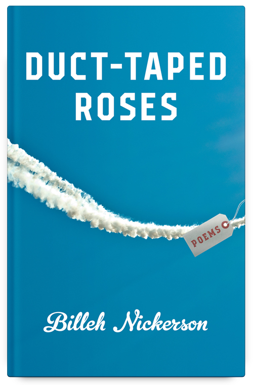
The title arose out of a signature poem about the author’s dad, who taped together bush planes with duct tape. The design that ended up on the final cover reflected this, showing only the contrail and then a morgue tag flying from the off-cover plane, like an advertising banner. (The author’s father died of cancer; the poem is a sort of elegy.) The type style chosen for the title could be created from duct tape.
A strong contender to my eyes was typographic. I formed a rose out of the title, with an exaggerated hyphen in the word “duct-tape” forming a piece of duct tape. The word “poems” formed a thorn on the stem, with the final, tiny S in red – a droplet of blood.
Many of these poems are quite funny, and I wanted to reflect that humour (and the fact that pizza figures in at least one poem) with a pizza box version. I like that cover still, as it approaches the book from a totally different angle from the others. It’s up to the publisher and author to decide on which approach hits the mark.
B*H: Was your process for designing Duct-Taped Roses very different from designing Plenitude?
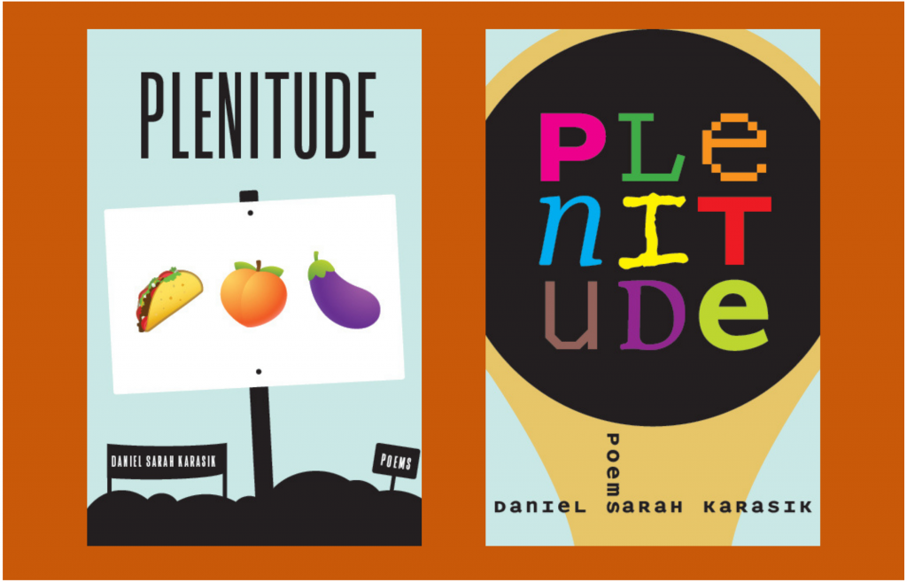
GL: Plenitude was a harder book to pin down. Political activism was central, so that was my direction from the start. But how to convey that without pigeonholing the book too much? Gender diversity is also central, so I tried one option with a protest and one sign with food emojis (eggplant, peach, taco) that are used for sex organs. I also tried typography with a highly stylized bullhorn.
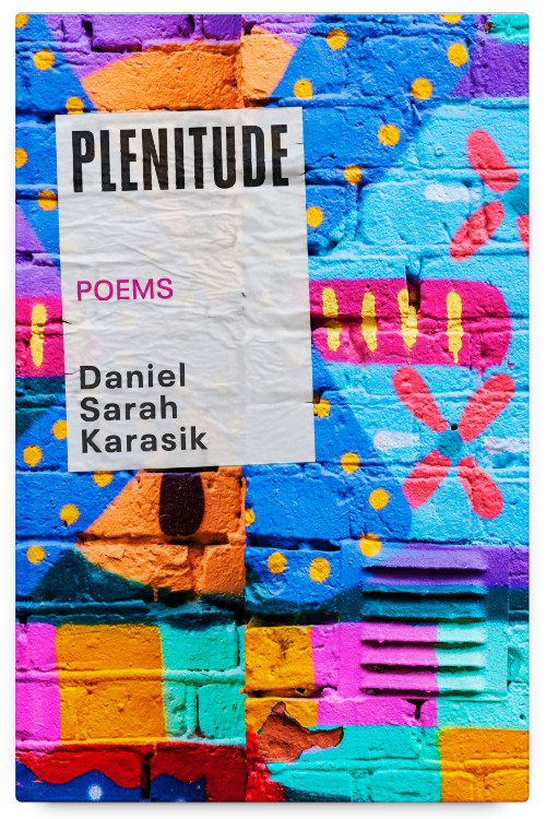
The process wasn’t that different from Duct-Taped Roses, but it did take longer to land a concept. Whereas, with Duct-Taped Roses, the chosen contrail concept was among the first group and was barely altered, it wasn’t until the second collection of ideas for Plenitude that I came up with graffiti – as lushly colourful as possible – to encompass both plenitude and political expression. To drive the concept home, I designed the cover-as-political poster, so all the text was on a poster that was photoshopped onto a graffiti-covered wall.
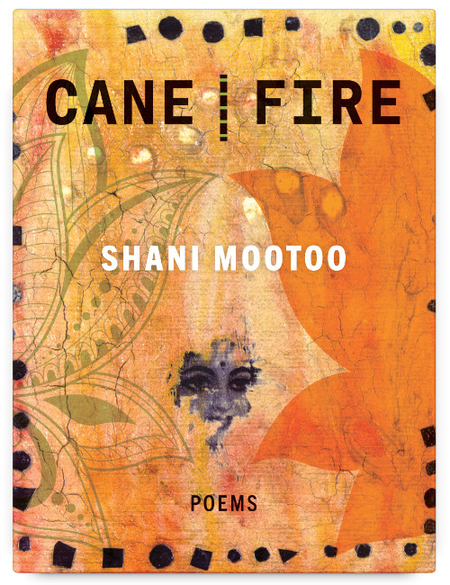
PS) Don’t miss these Book*hug staff favourites of Gareth Lind’s cover designs! Beloved Revolutionary Sweetheart by Beatriz Hausner; Dear Current Occupant by Chelene Knight; Re-Origin of Species by Alessandra Naccarato; Cane | Fire by Shani Mootoo; and Umbilical Cord by Hasan Namir.