On Design with Malcolm Sutton
“All [stories] have one thing in common,” says Chip Kidd, “They all need to look like something.”
In celebration of the visual aspects of book publishing, and the exciting world of cover art, we’re launching our first ever On Design series. Throughout spring 2022 we’ll be inviting book designers to the blog to share thoughts on art and design, and how they create visual entries into literary worlds.
To kick off the series we are joined by Malcolm Sutton. Sutton is a Book*hug Press fiction editor, designer, and author of the novel Job Shadowing. In the following interview Sutton shares thoughts on his favourite designs, the creative process, and the relationship between image and text.
B*H: You wear multiple hats at the press: you are a Book*hug editor, author, and designer. Curious to know if your editorial sensibility affects your design sensibility or vice versa?
MS: I’m certain that designing a book cover uses a different part of the brain from editing a novel, and this is such a relief. It’s an area of the brain concerned with visual contrasts, patterns, and eye movements. And also cultural signifiers. Book covers are such a play of cultural signifiers – the colour palette and fonts and choice of image will refer to different decades, emotions, attitudes, tastes. And of course to other books. We are so attuned to all these subtle signs, and they often guide us to or away from a book.
Sometimes I ask an author, does your book feel more like a ballpoint pen or a Sharpie or a photo. Each one of those media signify different things to us and will make the reader see the book in a different way.
B*H: Is there an editorial process when it comes to design? Do you rely on fresh eyes or external feedback?
MS: A number of people have eyes on the mock-ups – Jay and Hazel (the co-publishers) of course, our sales and marketing people too, and the author. I find that nudges and impressions from here and there often result in a better cover.
Time is an excellent editor too. I will work on a cover for hours in a row until I can no longer properly see it. The next day has a lot to say about the previous day’s work.
B*H: Do you have a favourite cover you’ve done for Book*hug? What about it stuck with you?
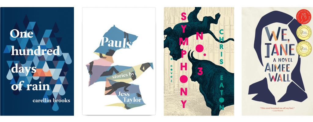
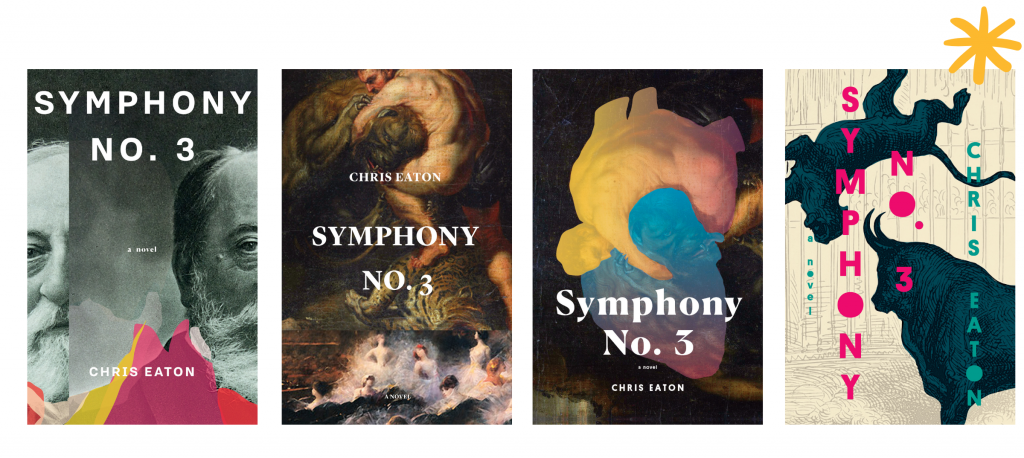
MS: I have a number of favourites! One Hundred Days of Rain, Pauls, Symphony No. 3, and We, Jane come to mind. They mark different times of the past decade so I associate them with those times of my life. A couple of things stick out about them: I had fun doing them and was able to learn something about design (about lines, about colour, about movement) through the process of working on them.
B*H: Can you talk a little bit about your creative process for designing one of these favourites.
MS: I’ll talk about Chris Eaton’s Symphony No. 3. The novel is set in the nineteenth century and makes references to a number of European painters from the period; it was natural to start by looking at some of those paintings. I also had in mind the New Directions cover for Tell Them of Battles, Kings, and Elephants by Mathias Enard – a novel that I thought had some similarities to Chris’s book, and a cover that I loved, designed by Peter Mendelsund. In his design, Mendelsund painted a kind of black rainbow (that doubles as a bridge) across an appropriated seascape painting. I liked that simple and conceptually strong solution to the cover. I searched through many images and was in frequent contact with Chris. We both liked a painting by Rubens (Hercules and the Nemean Lion) because it fit well with the themes of the novel (even though the painting itself predates the events of the novel). And from there I played around with the shape of the man and beast and turned them into a heart. So that was one contender. I also made a design using a photo portrait of Camille Saint-Saëns (who the novel is about), and one print of a bull fighting a tiger by Gustave Doré. In the end, we decided that the Doré image worked best because it was simplest as well as being wild and unexpected. It allowed for a fairly flat graphic cover, a bit like a poster – striking and simple.
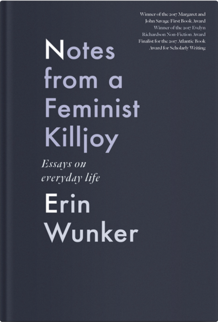
 B*H: Your design for Erin Wunker’s Notes From a Feminist Killjoy is elegant and simple—a dark grey background—the standout is the text. Please share some of your thoughts on typography. Why is it important? How do you find the right font? Do you have a go-to type?
MS: If I recall, Erin asked for a Futura-like font for the cover. I was happy to go with that. There are likely hundreds of fonts that follow from Futura (like the Toronto subway font). I ended up using Futura itself, partly for its schoolbook feel and also for its wonderful geometries. From there it was very much about choosing the right weight (e.g., light, bold, black) and the right spacing. The subtle differences in colour for the text. I remember thinking that it was very much an exercise in typography. I don’t have a go-to font for book covers. Often many are tried out, and sometimes I do them by hand.
B*H: Certainly the look of the cover affects the reader’s ability to notice and feel attracted to a book among a sea of other options. I am wondering though, how do you think design informs or interacts with the reader’s experience of the text once they are already reading?
MS: The cover can certainly affect the reader’s experience of the text. On the subway, you might see someone reading a book and then closing it to look at the cover then opening it again to continue reading. You wonder, are they looking to confirm something about the text or about their experience reading it? People sometimes do that with the author’s photo and back-cover text as well. I’m really sensitive to book covers, so an inadequate cover can definitely taint my reading experience. When you strongly feel the hand of marketing – that the cover is targeting a specific market in a heavy-handed way – that can damage the reading experience. I felt that way with a book that I read last year. I kept thinking, this book is so far beyond the disposable non-fiction that the cover suggests.
Your question also makes me think of some covers from the eighties in which there is an attempt to show the narrative of the book through a number of significant objects, sometimes in a kind of airbrush illustration style. My Vintage paperback copy of Nicholson Baker’s The Mezzanine is a good example. That approach is a bit too literal and invites the reader to start matching text to cover, which I think is a bad thing. But I don’t see a lot of that approach now. I think most book designers attempt to convey the spirit of the book rather than the narrative.
As part of our design process at Book*hug, the author often lists a few book covers that they like or that we should think about when designing theirs. One thing that I’ve noticed is that sometimes a cover that an author mentions is not particularly good or memorable, but the book itself is phenomenal. I think that sometimes a process happens in which the power of the book makes a so-so book cover culturally important. For example, I’ve had authors mention the I Love Dick cover, which is made up of “I Love Dick” and “Chris Kraus” and a generic photo of an opened notebook with a pen sitting in it and a glass ashtray to the side. If it were a lesser book, I doubt that the cover would be remembered. But because the book is so powerful, the cover takes on some of that. The cover becomes good because of the book.
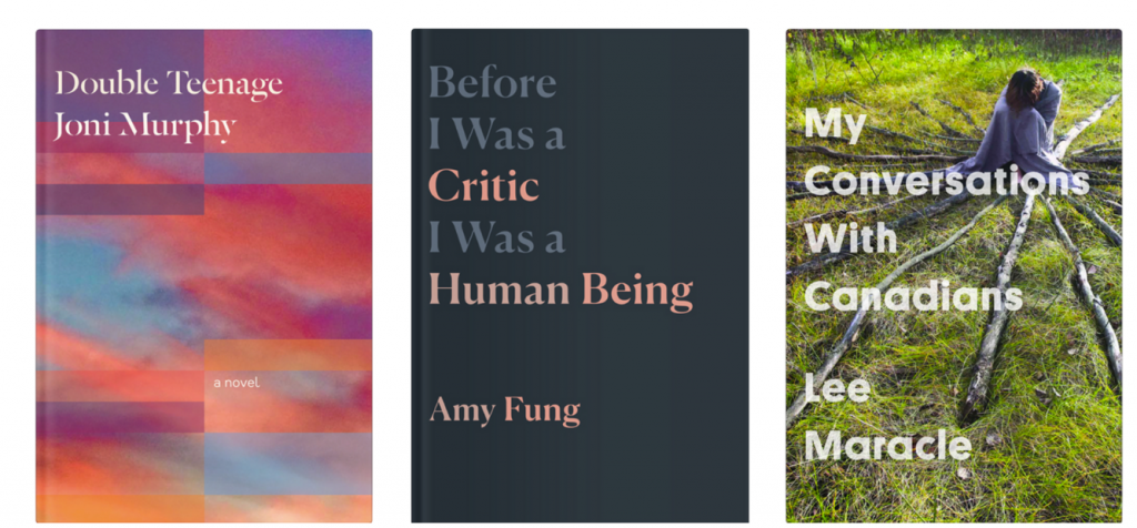
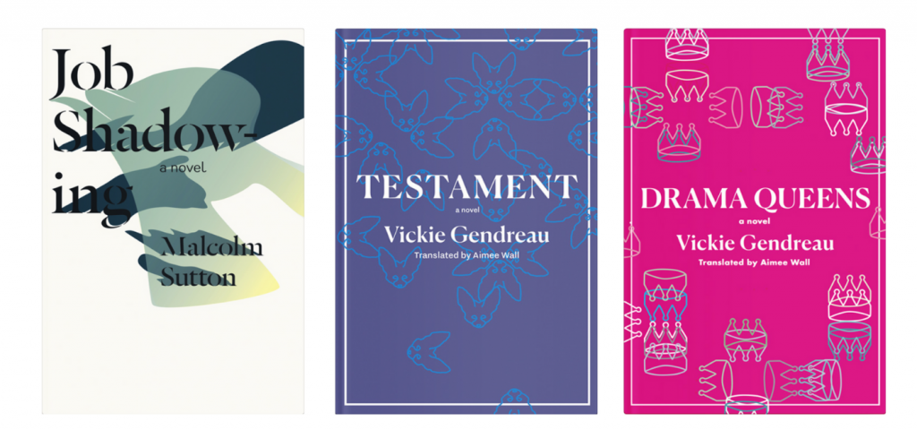
PS) Book*hug staff would also like to share a few of our favourite Malcolm Sutton covers, including: Double Teenage by Joni Murphy; Before I Was a Critic I Was a Human Being by Amy Fung; My Conversations with Canadians by Lee Maracle; Job Shadowing by Malcolm Sutton; and Testament and Drama Queens by Vickie Gendreau, translated by Aimee Wall.
