On Design with Ingrid Paulson
Next up in our On Design series, we’re joined by the talented Ingrid Paulson. Paulson is an experienced cover designer; a master of interior design and layout; and a recipient of an AIGA 50 Books/50 Covers Award and an Alcuin Award for Excellence in Book Design. On top of running her own design studio, she teaches at the Chang School for Publishing, and is the Publisher of Gladstone Press. Read on for her thoughts on the joys and challenges of design, what it takes to put together a great interior, memorable Book*hug covers, and more!
B*H: How did you find your way into book design? Are you a big reader?
IP: When I was a kid, I would copy out my Dick Bruna board books – both illustrations and text – cut, fold, and staple together the pages, and then hand them out to neighbours on my street. So I guess I always had an interest in book design but had no words to describe it. As I grew up, I actually thought I’d become a writer because that was getting me the most attention and the better grades, but I like a challenge, so I focused on improving my art skills so I’d get into OCAD. I wasn’t confident enough to apply for the fine art program, so I opted for graphic design. It was more practical.
I got worn down by corporate and marketing design, which is where I started, so I thought I’d downgrade to a simpler job in house and focus on a fine art career – I had shown some pieces in group shows and with art collectives, and wanted to explore that for a few years. I answered a job posting for McClelland and Stewart thinking I’d be putting together ads, but it was for a book design position. The rest is history.
(And yes, I read a lot and always have, though these days it’s mostly manuscripts for work.)
B*H: What do you most enjoy about the design process? What is the most challenging aspect?
IP: The most enjoyable is when I let my brain relax – after days of reading and research (because there’s a lot of subject and image research) I have to let my brain do its job, and let the idea come to me. And then I may be lucky enough that I can make that idea work. (It’s amazing how few times that happens.) And that concept looks fresh and new. And the author and publisher love it. That magic happens about once a year, but it is why I am still in this job.
The most challenging is trying to explain a design, especially when I have to defend it because it isn’t what a publisher or author wants or understands. I have to listen then, and listen hard to what is really the problem, and sometimes it’s my design, so I have to back down. I am still learning how to listen.
The least enjoyable (I know, you didn’t ask) is to work on a Frankencover. This happens a lot with books and authors where the stakes are high and no one has a clear idea how to position the title. There’s a lot of hesitation, second-guessing, and fear that goes into the feedback I receive. So, bit by bit, a design gets picked apart and reassembled until it is inevitably abandoned because no one wants to go one more round on it. It is a soul-destroying process, whatever the outcome.
B*H: Do you have a different way of thinking about/approaching a design for a fiction title vs. a nonfiction title?
IP: Every genre has its own design demands and assumed identities, so it’s more about figuring out who reads that genre and playing matchmaker between the author and reader.
The biggest difference between literary fiction and essays, for example, is that the cover for a fiction book tries to elicit an emotional response from the reader, and the essays focus on argument and perspective. But essay collections can look very emotional and suggestive, and literary fiction can look very straightforward and logical. It really depends on the book and the cover brief.
B*H: Do you have a favourite cover you have designed for Book*hug? What about it stuck with you?
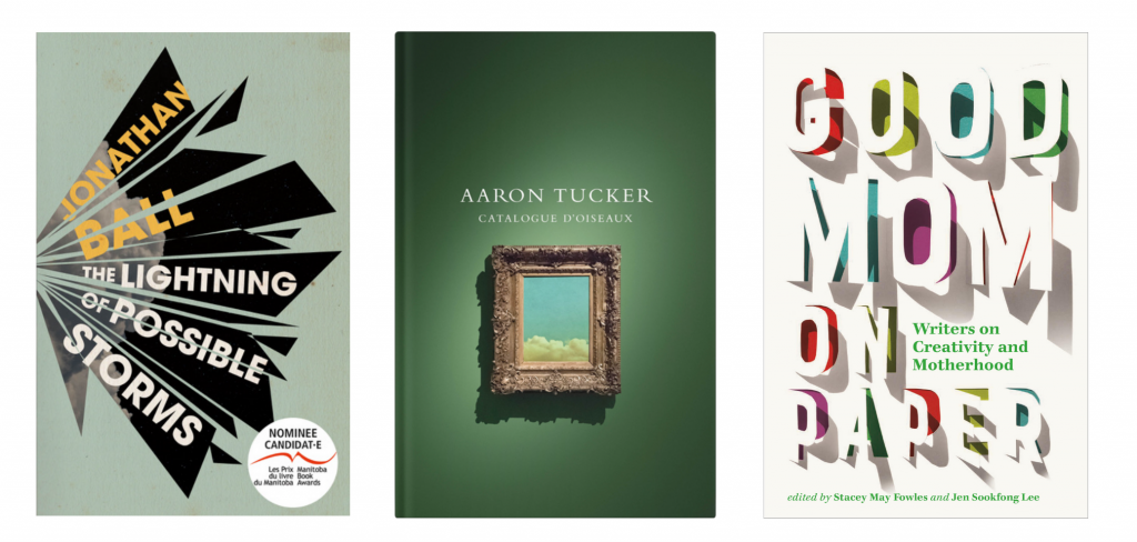
There are quite a few. Jonathan Ball’s short story collection, The Lightning of Possible Storms, stands out for me – it was fun to create the explosion on the front and figure out a way of suggesting mood and energy without really explaining anything. I felt I’d gone out on a limb with that one, so I was so happy Jonathan and Book*hug loved it too.
Aaron Tucker’s latest poetry book, Catalogue d’oiseaux, was great for two facts: when I started out as a book designer there was a (fake news!) rule that green books don’t sell. No data points for it, no history of sales slumping. It was because an art director fudged the truth to avoid having to use green on covers: back in the day, green was one of the most difficult colours to accurately print and he didn’t want the hassle. Using that luscious, velvety green and having it look so good? Can’t ask for better. Second, we slid an Easter Egg onto the cover – a thumbnail image from his previous novel. I love the sly nod.
Right now I’m really, really excited about the cover for Good Mom on Paper. None of us wanted to focus on children for the cover, and it made sense to somehow show all the competing demands on writers’ time while raising children. So every letter is a door to show that every decision leads to a different outcome, and the letters are all carving away at the paper, the writing surface itself.
 B*H: Do you have a favourite Book*hug cover designed by another designer?
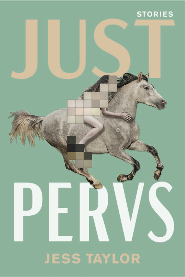
IP: Other designers? Tree Abraham’s concept for Just Pervs stands out. It’s perfect, and I really wish I’d thought of it. That’s about the best compliment I can think of.
B*H: You often design interiors as well as book covers. Can you share a little bit about this often less understood/appreciated aspect of design?
IP: The two forms of book design – the cover and the interior – are pretty much polar opposites. Some cover designers can’t quite grasp how to make an interior sing, and vice versa. So I have no idea how I manage to do both, to be honest.
For interior design and typesetting, you have to love typography and be attuned to how people read. The entire goal of an interior design is to set it and let the reader forget it: there should be only minimal distractions from reading, and those distractions should enhance the experience. I find it very meditative to figure out a layout, to delve into the author’s text and work out how to best present it – what typeface works best for the setting, the era, the format of the text itself? Is there a lot of dialogue, short or long paragraphs? It’s like fitting together a 1,000 piece puzzle sometimes.
Covers are different. I need to make sure that within 1.5 seconds, the reader is intrigued enough to pick up the book or click through to read more. The design has to hint, to tease, to lure someone in. It can’t be exhaustive or literal – those details will get lost on the cover or may drag down the overall impression. Because that’s what covers do: they impress, not explain.
B*H: Do you draw inspiration from other areas of design – e.g. furniture design, advertising, automobiles, etc?
IP: Everything. Posters, graffiti, flyers, ads, websites, garden design… maybe not automobiles as they don’t really change all that often. Design is about visual communication, so the world itself informs the design, which then goes out into the world and influences other designs. Think of a hall of mirrors, each refracting a part of the world and creating a new way of seeing.
B*H: What advice do you give to your design students when they are starting out? Is there a golden rule of design?
IP: Oh boy. Read the text. Look to your shelves. Book design is an old, old practice so no one is going to jump in and reinvent it, not without learning from the past. And no matter what you decide to do design-wise, it must respect the author’s intent and surpass the reader’s expectations.
Also, design is about acceptance and rediscovery, not hard-and-fast rules. We’ve built up a generally accepted way of putting together a book – this isn’t based on focus groups or scientists studying our brains’ reception to 11pt type or a rainbow blotchy cover. I’m sure if we’d never developed the codex, we’d be perfectly happy with reading scrolls. And for covers, we accept certain visual tropes, then we then grow bored and try to find new sparkly things to capture our imagination, and then we rediscover those visuals from years ago and look at them with new eyes. It’s a cycle.
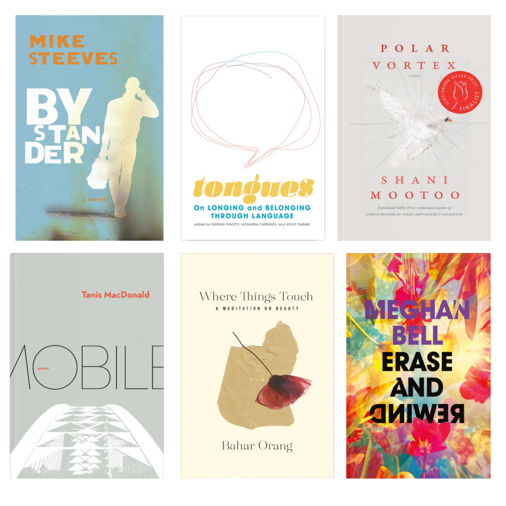
PS) Book*hug staff would also like to share a few of our favourite Ingrid Paulson covers, including: Bystander by Mike Steeves; Tongues edited by Eufemia Fantetti, Leonarda Carranza, and Ayelet Tsabari; Polar Vortex by Shani Mootoo; Mobile by Tanis MacDonald; Where Things Touch by Bahar Orang; and Erase and Rewind by Meghan Bell.

One Reply to “On Design with Ingrid Paulson”