On Design with Tree Abraham
Today, we welcome Tree Abraham to the Book*hug blog for the next instalment of our On Design interview series! Abraham is a book designer, illustrator, and writer. And one need only take a brief peek at her work to get an immediate sense of her visual dexterity, flare for colour, and love of all things art.
We are also excited to announce that in Fall 2022, Tree Abraham will be joining us not only as a designer but as an author too, with her debut book, Cyclettes. Part memoir-travelogue, part psycho-sociological snapshot, Cyclettes is a series of vignettes, sprung from a list of every bicycle Tree has ever known, ridden, or dreamed about in the abstract. Circling themes of belonging, freedom, and identity, this is a book that roams many pathways of thought, contouring life’s biggest questions.
Without further ado, here is Tree Abraham on her creative process, her greatest covers, and the long road to becoming a designer.
B*H: For starters, where do you typically begin with a cover design?
TA: Every brief is different. There might be a manuscript or sample chapters or only a summary. Sometimes I am working directly with a publisher, an editor, an art director, or an author (via a questionnaire). I might be provided with motifs, imagery, passages from the book, a list of keywords, or a scrap of fabric.
I don’t really have a preference for where a brief ends and I begin, because even in its scantest form, I am not beginning from nothing. Whether loosely sketched or literally dictated, the project begins and ends with a book.
The book is the art, the cover its door. I feel safe in knowing that anything I design will be in conversation with the pages behind it. Even the cover itself is a conversation between type and image.
Knowing that the cover can’t say everything, I start by exploring what it should say. A kind of waltz occurs between brainstorming concepts based on research surrounding the book’s themes and gathering visual inspiration that conjures the mood set forth by the author. I love this stage because my intellectual and emotional faculties are equally activated.
B*H: Do you have a favourite design you’ve completed for Book*hug? What about it stuck with you?
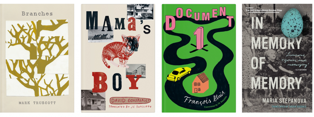
TA: I have loved so many of my designs for Book*hug. Branches by Mark Truscott might be my favourite because of its effortless sparseness: I painted a tree, cut it up, and rearranged it. My favourite briefing note was for Mama’s Boy by David Goudreault, translated by JC Sutcliffe (“we want a dead cat on the cover”). My favourite book might be Document 1 by François Blais, translated by JC Sutcliffe, or In Memory of Memory by Maria Stepanova, translated by Sasha Dugdale.
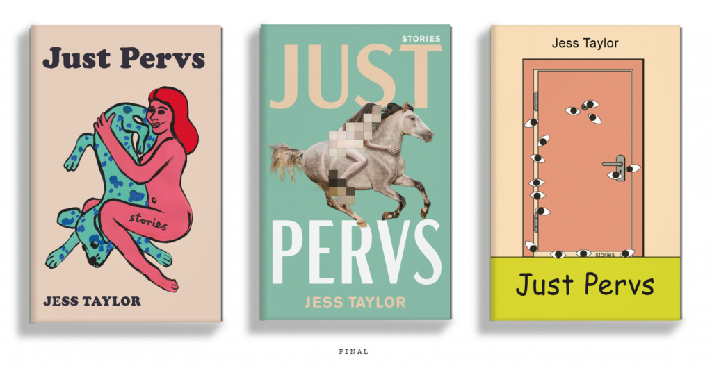
My favourite killed covers were from Just Pervs by Jess Taylor and The Nonnets by Aaron Giovannone.
 My most recent favourite book and cover is The Employees by Olga Ravn, trans. by Martin Aitken.
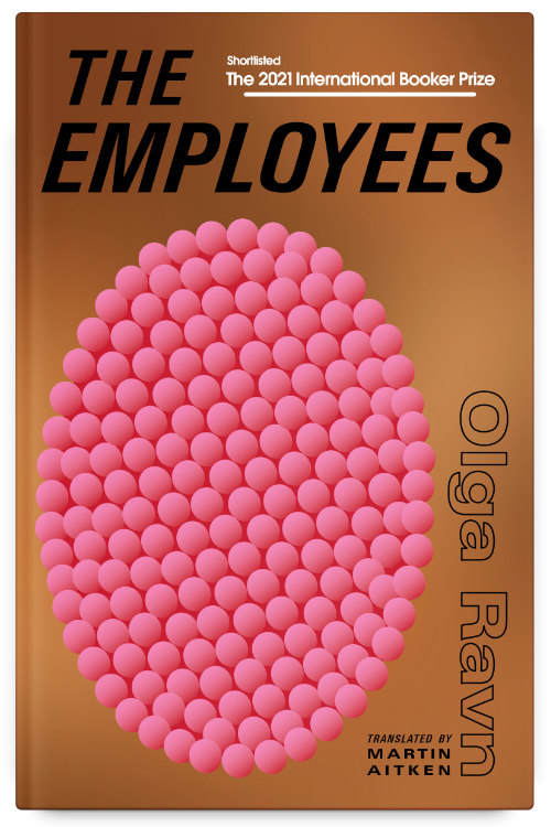
B*H: Can you tell us a little bit about your process for designing The Employees? We love the pink!
TA: The process for The Employees was swift. I absolutely adore the New Directions cover, but the mood boards from the author included in Book*hug’s brief leaned more towards the Lolli Editions cover—kind of space age retro, geometric shapes, Swiss typography. The crew’s fixation on the strange object(s) seemed to be the nucleus of the story, and the most unique element of the text to embody on the cover. Its description was all I needed:
“It’s as if at any time, one of them can always be the others. As if they don’t actually exist on their own, but only in the idea of each other. They can multiply whenever they like, in bunches and clusters. On the hillsides they can resemble a kind of eczema…They make me touch them, even if I don’t want to. They’ve got a language that breaks me down when I go in. The language is that they’re many, that they’re not one, that one of them is the reiteration of all of them…The egg is as large as an add-on, or the head of a child hologram; it’s warm and it pulsates, and I feel the same pulse in my lips.”
I wanted the image to have a visceral dimension, which the crew was trying to elucidate. There’s something trypophobic, or the opposite of such a sensation, with the cover egg.
A subtitle that is left off some of the editions is A workplace novel of the 22nd century. The subtitle is perfect, but unnecessary. The title does so much work. Any otherworldly, abstract depiction sitting near it immediately stirs mystery in the viewer, they know this is not an ordinary office drama, though these days I suppose we’re all living in a post-ordinary world.
B*H: Design wasn’t your first foray into the professional world. What drew you to design later in your career? Is your sense of design informed by previous experiences?
TA: My first degree was in International Development and Environmental Sustainability. It was all about cultivating a multi-disciplinary understanding of interconnection up from my local, to the global, and back down to someone else’s local. I spent a lot of time living and traveling in different countries, working with NGOs and the federal government, and finding myself within the foreign.
As a child I was already unknowingly a designer. Every art project was a handmade iteration of what I do now. I would make greeting cards, packaging, a family newspaper, posters for fake events, elaborate title pages for each duo-tang-bound school subject. I didn’t grow up in an artistic community, so it wasn’t until I was exposed to creative professions in my early 20s that I saw a future career in a field that matched how my brain worked. I can’t explain exactly why book design, but my decision to get a degree in Graphic Design was always paired with my desire to be a book designer. For me, it is a difficult trade. I am still challenged, still learning.
Everything outside of design informs my sense of design because design is a tool for communicating non-design things. Witnessing cultures around the world and in my neighbourhood, in all life’s vast and ever-changing states, is central to creating bespoke covers that distill a spark of that.
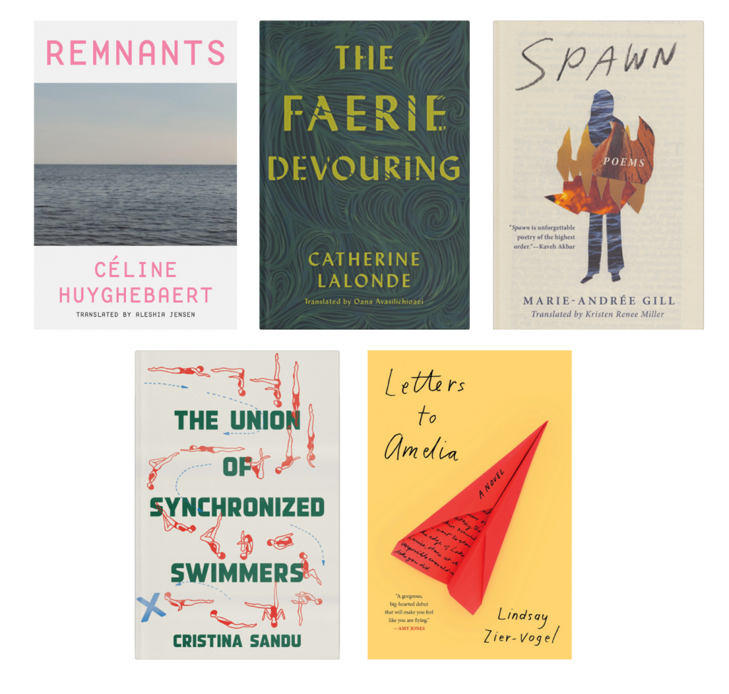
PS) Don’t miss these Book*hug staff favourites of Tree Abraham’s cover designs! Remnants by Céline Huyghebaert, translated by Aleshia Jensen; The Faerie Devouring by Catherine Lalonde, translated by Oana Avasilichioaei; Spawn by Marie-Andrée Gill, translated by Kristen Renee Miller; The Union of Synchronized Swimmers written and translated by Cristina Sandu; and Letters to Amelia by Lindsay Zier-Vogel.